Sleepwalkers: Round One by Izzi Breigh

"Sleepwalkers: Round One" book cover. The cover features an illustration in a graphic style with hard black outlines. Three kids stand in front of the shadow of a mansion surrounded by dead trees. On the left, there is a shorter boy in shorts, a sweater, and a blue baseball cap. In the middle is a tall girl with brown hair in pigtails wearing a yellow t-shirt and jean shorts. On the right is a short boy with shaggy brown hair, a long t-shirt and pink shorts. Their image is reflected beneath them in black and white like a mirror image. They are surrounded by werewolf-like creatures in the reflection.“No one goes to the Old Sleep. Not willingly,” said the attendant.

And there it was: the Old Sleep. Ellie had heard that’s what they call it.

“Some friendly advice for you, free of charge,” said the attendant, leaning closer to Ellie’s father. “My late wife, God rest her soul, used to say, ‘Stay away from people with bad reputations. They got ‘em for a reason.’ I think the same could be said for houses.”

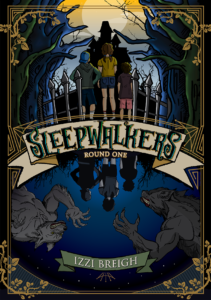
Welcome Izzi Breigh, a new voice in middle-grade horror whose debut novel SLEEPWALKERS: Round One (ISBN: 978-1-7379135-0-4, Somnium Publishing, February 22, 2022) will be published this Winter.  In the first book of a four-part series, it is 1986 and 11-year-old Ellie Dasher moves from her comfortable hometown in Florida to a house named “Old Sleep” in Connecticut.  Oddly, the house was left to Ellie and her younger brother Elijah.  Soon their family will find out why the children are so important to the house.

Old Sleep is every bit a classic haunted house from its creaky stairs and broken grandfather clocks to the deep family secrets that Ellie is compelled to uncover. Just as she starts to learn the history of the Dasher family home, tragedy strikes. Her brother Elijah falls ill after a horrifying ambush that both Ellie and Elijah experience while having a nightmare. How is Ellie going to make her parents believe that it was a dream that put her brother in a coma?

Fortunately, Old Sleep has a ghostly guide, and with his help, Ellie stumbles into the mysterious world of Inzien and the Sleepwalkers.  She doesn’t know who they are or what they do, but she is certain her brother has been taken to their world and is in trouble.  It’s a strange place with creatures and characters right out of the nightmares of children.  In fact, Sleepwalkers can only visit the mysterious world of Inzien while they are asleep. They are also the only ones who can help Ellie get her brother back- and the clock is ticking.

The heart-pounding first installment, SLEEPWALKERS: Round One is a frightening thrill ride that fans of Lemony Snicket and Neil Gaiman will be eager to discover.  With all manner of strange folk, hostile monsters, and odd foods, the land of the sleepwalkers is a place that dreams are made of. But Ellie Dasher is learning that some dreams have sharp teeth and, yes, they do bite.

About the Author

Izzi Breigh, raised by a family of peacocks, grew up on a rutabaga farm. She now resides in a small cottage made entirely of pinecones. Izzi enjoys knitting shirts for starfish, rooms without corners, and peddling time. Her day job is filling hourglasses with precisely the right amount of sand, which she sells for 2 copper pennies every Saturday at her local flea market. Hide and seek is her favorite sport and though she has repeatedly spotted Waldo, she has yet to figure out where in the world is Carmen Sandiego.

SLEEPWALKERS: Round One
By Izzi Breigh
Somnium Publishing
Publication Date: February 2022
ISBN (paperback): 978-1-7379135-0-4
ISBN (eBook): 978-1-7379135-1-1
Original Trade Paperback / eBook
Price: $19.99 /  $9.99 MSRP
Pages: 332

# # #

Kayla: A Modern-Day Princess A Little Magic by Deedee Cummings

A colorful book cover in watercolors. The titles reads "Kayla: A Modern-day Princess A Little Magic". A young black woman in a pink and purple ball gown sits on a crescent moon over a blue background with spotlights and stars behind her.Kayla always had a plan. The problem was a lot of other people had a plan for Kayla too. But as a Modern-Day Princess Kayla has grown into an independent young woman. Why do people do that? Plan your life for you and tell you what they think you should be?”

Kayla is a girl with a plan- her mom taught her from a young age to always start the day with a plan, because a plan gives you hope. The first of the Kayla: A Modern-Day Princess books followed her journey and struggles as a young, modern-day princess trying to navigate lessons in friendships, fairness, and self-confidence. As one reviewer said, “She’s an inspiration to all young girls who believe in their dreams!”. 

In the fifth and final book of the series, Kayla: A Modern-Day Princess: A Little Magic (Make A Way Media, 10/21/21, 978-1-951218-29-4 , Paperback), Kayla has been following her own plan for success. Having gone off to college, she returns home to share some “big news” with her parents. She meets up with her old friend Tommie, and together the two of them reminisce about some of their struggles and their successes- shared, old, and new. The childhood friends part ways after catching up and Kayla goes to meet her parents and share her news. However, Kayla’s mother has been busy as well. She has her own expectations for what the big news could be! 

Plans are great, but sometimes two people have plans that clash. Can Kayla and her mom reconcile their misunderstanding? How will Kayla handle her mother’s expectations and her own desire to follow her dreams and find her own path? 

With beautiful, eye-catching illustrations, the Kayla series as a whole tells an inspiring story that’s inspired by the true life of Broadway actress Kayla Pecchioni. The series will spark important conversations between children and parents about diversity, speaking up, and pursuing your dreams even when it feels like the world is against you.

About the Author

Deedee Cummings is an accomplished therapist, attorney, author, and mom. She is the founder of Make A Way Media, a company that specializes in promoting positive messaging and diverse media and the non-profit organization, It Pays to Read, which literally pays kids to read as a way to promote literacy and a lifelong love of reading. The Kayla series was created to inspire all children to develop a plan and pursue their dreams, even in the face of adversity. Deedee Cummings is creating the stories and representation she wished she’d had to read to her children as they grew up. Her mission is for children to see a world through books that reflects and celebrates the diversity of the world we all live in. 

Kayla: A Modern-Day Princess
Book 5: A Little Magic
By Deedee Cummings
Illustrated by Charlene Mosley
Make A Way Media
Publication Date: October 21, 2021
Paperback ISBN/Price: 978-1-951218-29-4
Pages: 60

# # #

Design 101: Typesetting

There’s a lot of thought that goes into self-publishing. If you’re an author, you’ve probably given a lot of thought to a few key things about your book such as the jacket, the title and the content. If you’re a reader, these are probably the things you regularly pay attention to as well. Have you ever thought about the interior of a book? How the pages are laid out, the margins set up, or the style of the chapter headings?

If you haven’t thought about those things, that means that the person behind the book did a good job typesetting. Typesetting is the process of properly setting the text on to the page of a publication. Bad typesetting can completely ruin the reader’s experience and interrupt the flow of the book. The last thing you’d want is for a reader to stop paying attention to your carefully crafted work because the spacing between lines is uneven!

When self-publishing, you will eventually have to deal with typesetting. Here are some simple dos and don’ts of this book design fundamental:

Don’t think it’s a simple job.

Typesetting on the surface sounds like it would be easy. After all, you have probably used word processors like Google Docs or Microsoft Word before. These programs can handle simple design tasks, but when it comes to the nitty gritty, they can’t handle a book interior. Which leads me to…

Don’t choose the wrong software.

It may be easy to try and make a program like Word work for you- you already own it and are familiar with it. However, word processing programs are not built for typesetting. While they may be able to handle some basics such as kerning, margins, and fonts, they are frustrating to use. Bending a program to try and fit your needs is harder than using a program built for typesetting. I have used Adobe InDesign for typesetting in the past and highly recommend it. Other programs include LaTeX, Reedsy Book Editor, or Bookwright by Blurb. 

Do study up on the basics.

There’s probably a lot of terminology and best practices that you won’t know going in. Typesetting is not easy to do well. I suggest looking over Canva’s illustrated typography terms to get an idea of popular terms. Typography and typesetting are different, but they have a lot of overlap! After that, start reading up on things like font choice or industry standards.

Do consider hiring a professional.

Let’s face it: you’ve got a lot going on already when you’re self-publishing. If you don’t have time to sit down and learn how to typeset properly, it might be best to hire someone. A professional will already have the appropriate software, the knowledge of how to use it effectively, and should be intimately familiar with the best practices. There’s a lot of typesetters out there who have a skillset to match your project. It may cost more than DIY, but the result will be less frustrating and more professional. 

If you found this helpful, check out our other blogs on design and self-publishing.

Accessible Design: UI Choices

Accessibility in design, when presented online, extends far beyond the visuals. My last two blog posts in this series focused on color choice and font choice. This post will focus on some more technical aspects of accessibility. These have more to do with user interface, or UI, design and accessibility. Good UI can make or break how some people interact with your content.

UI Essential: Alt-text

I briefly brought up the use of screen readers when I wrote about font choice. Screen readers are a tool that visually impaired users may rely on to navigate the web. Their name is self-explanatory; screen readers read text aloud for users who cannot read. However, text is usually the only thing that screen readers pick up on. They cannot interpret pictures. If you want a user to know what is presented in an image, then you need to use something called “alt-text”. Alt-text is found either in the metadata of an image or in the caption of an image. Some website managers allow you to add this metadata when you upload an image. If you use WordPress, for example, you may have even noticed a box labeled “alt-text” when you upload images.

It is useful to provide alt-text for any non-decorative images. For instance, if a restaurant’s website has an image of their menu uploaded, the alt-text should list off the items on the menu. The same goes for charts or diagrams that rely on visual elements. Otherwise, the information will be inaccessible to a user with a screen reader. With images that don’t have text, you can provide a description. Aim to be as descriptive and concise as possible. A user doesn’t need every little detail, but adding some flair is nice. Using proper alt-text conveys valuable information and makes for a more inclusive experience. If you’d like to include alt-text in social media, you can do so in the description or caption of your image-based posts. It won’t affect the metadata of the uploaded image, but a screen reader will catch it.

Keyboard Access

Making a website keyboard accessible is another technical design element. Many users, both with and without disabilities, rely solely on their keyboard to use their computers. It can be a very efficient way to complete a workflow. It is important that your web page follows some basic, standard commands. For instance, every element should be selectable using the tab key and either the space bar or the enter key should activate an element. These are just a couple examples. For a much more thorough guide, you can consult with WebAIM’s guidelines for keyboard accessibility. 

This one can be a bit harder to implement on social media since you don’t own those domains and can’t edit the code. How accessible those websites are is largely out of your control. However, many people do create their own blogs and websites. If you have a website, keep this in mind when selecting a pre-made theme or customizing one through code.  

I hope this has made you more aware of some of the ways people use the web. Remember that it is, however, only a small sample of the ways you can make things more accessible. The more you think about unique user cases, the more accessible you can make your content!

Accessible Design: Fonts

Most of our daily activities involve reading text in some way, but we usually don’t stop to think about it. When you read the nutrition facts on the back of your morning cereal or pick up your tablet to scroll through the morning news, you don’t consider the typeface you’re looking at. In many cases, this is a good thing. Reading would be very difficult if we had to pause and look at every word or character. Information designed to be accessible should not make a reader struggle. Previously, I discussed some of the basics of how to choose a font. This time, I will be looking at font choice through the lens of accessibility. There are two main ways to achieve accessible design using fonts: consistency and familiarity.

Consistency in Accessible Design

First and foremost, you should stick with one or two fonts in your designs. A separate font for a header and body of text are acceptable. It can help readers easily find what they are looking for. Using too many fonts close together, however, can be confusing. It will make a reader stop and think about what they’re looking at. When reading text, flow is important to understanding. Anything that interrupts that flow makes it less accessible. This can also include using fonts that don’t have even spacing between characters, often referred to as kerning.  Wide gaps between characters can cause a reader to stumble, whereas small gaps can simply make words unreadable.

font samples

Consistency can also mean making sure the font you choose has uniform serif or not. Serif refers to the decorative “tail” that letters sometimes have (Times New Roman is an example of a serif font). Sans-serif fonts, like Arial, do not have these decorative marks. There is ongoing debate over which type of font is better for reading in print versus digital. The more important thing is to choose one style and stick with it.

Font Familiarity

There are several standard fonts that are widely available on most devices, such as the previously mentioned Times New Roman or Arial. Using any of these well-known fonts will foster familiarity in a reader. Fonts that are similar to them will do the same. Again, the reason is so the reader doesn’t have to waste any time thinking about what they’re looking at. Characters need to be easy to distinguish. There is a time and place for a fancy script or a bubbly font but limiting it to non-essential information is good accessibility practice. When you want to show something clearly, simplicity is best.

In addition, avoid using highly specialized characters on the web unless they’re appearing in a graphic. People with impaired vision often use screen readers to browse the internet. These special characters often look like a font change to a sighted user, but they cause screen readers trouble. If you’d like to hear how screen readers interpret some special characters, please check out this video from Twitter.

If you found this useful, check out my previous blog about accessibility in design!