Accessible Design: UI Choices

Accessibility in design, when presented online, extends far beyond the visuals. My last two blog posts in this series focused on color choice and font choice. This post will focus on some more technical aspects of accessibility. These have more to do with user interface, or UI, design and accessibility. Good UI can make or break how some people interact with your content.

UI Essential: Alt-text

I briefly brought up the use of screen readers when I wrote about font choice. Screen readers are a tool that visually impaired users may rely on to navigate the web. Their name is self-explanatory; screen readers read text aloud for users who cannot read. However, text is usually the only thing that screen readers pick up on. They cannot interpret pictures. If you want a user to know what is presented in an image, then you need to use something called “alt-text”. Alt-text is found either in the metadata of an image or in the caption of an image. Some website managers allow you to add this metadata when you upload an image. If you use WordPress, for example, you may have even noticed a box labeled “alt-text” when you upload images.

It is useful to provide alt-text for any non-decorative images. For instance, if a restaurant’s website has an image of their menu uploaded, the alt-text should list off the items on the menu. The same goes for charts or diagrams that rely on visual elements. Otherwise, the information will be inaccessible to a user with a screen reader. With images that don’t have text, you can provide a description. Aim to be as descriptive and concise as possible. A user doesn’t need every little detail, but adding some flair is nice. Using proper alt-text conveys valuable information and makes for a more inclusive experience. If you’d like to include alt-text in social media, you can do so in the description or caption of your image-based posts. It won’t affect the metadata of the uploaded image, but a screen reader will catch it.

Keyboard Access

Making a website keyboard accessible is another technical design element. Many users, both with and without disabilities, rely solely on their keyboard to use their computers. It can be a very efficient way to complete a workflow. It is important that your web page follows some basic, standard commands. For instance, every element should be selectable using the tab key and either the space bar or the enter key should activate an element. These are just a couple examples. For a much more thorough guide, you can consult with WebAIM’s guidelines for keyboard accessibility. 

This one can be a bit harder to implement on social media since you don’t own those domains and can’t edit the code. How accessible those websites are is largely out of your control. However, many people do create their own blogs and websites. If you have a website, keep this in mind when selecting a pre-made theme or customizing one through code.  

I hope this has made you more aware of some of the ways people use the web. Remember that it is, however, only a small sample of the ways you can make things more accessible. The more you think about unique user cases, the more accessible you can make your content!

High Quality Reels: A Beginner’s Guide

The head of Instagram, Adam Mosseri, recently announced that Instagram is no longer just a photo-sharing platform. This announcement created some confusion, but is no cause for alarm. Since the release of Reels, Instagram has been leaning further towards short form video. Today, I’m going to talk about how to make a high quality Reel. 

What is a Reel?

A Reel is a short-form video on Instagram that is under one minute. They are designed to entertain and have a strong organic reach. 

Three Steps to Make High Quality Reels

Hook your Audience in the First Three Seconds

Attention spans on social media are extremely low. In order for your Reel (or any social media content) to be successful, you have to stop the scroll. This means catching their attention quickly by quickly stating the problem you are going to solve for the watcher. 

Provide Value in Your Video

Although “value” has become a bit of a buzzword, this just means that you are not creating fluff. Share content that entertains, informs, or inspires so your audience can see the value you have to offer. 

Your hook gets people to your video, but the value provided is what makes them stay and consume more of your content. 

Use a Call to Action in Your Reels

People will not engage with your content in the way you want them to unless you tell them how to do so. If you want people to comment, tell them! All of your Reels should have a CTA to maximize your engagement.

Do I Have to Make Video Content?

You do not have to make video content, but you should. Video content has consistently been shown to be more engaging and effective than other types of content on social media. People enjoy consuming short-form video content which is why TikTok has been such a success. 

Pro-tips for High Quality Reels Content

Create a series around something you are passionate about and knowledgeable in. You do not have to dance or point to make a Reel that performs well, you just need to show up consistently with valuable content. 

If you have any questions about how you can use Reels in your social media strategy, please contact us. 

Other Helpful Posts

Instagram Insights: A Beginner’s Guide

Expanding Your Organic Reach on Instagram: Video Content

3 Social Media Metrics That Do Not Matter

Social Media 101: TikTok and Book Promotion


Writer’s Block: Simple Solutions

Writer’s block can happen at any time.  It is not a commentary on your ability to write.  All kinds of artists experience blocks including musicians and performers.  I am one of these and sometimes I just can’t practice.  A trick I learned is to set a timer for 15 minutes.  Practice for only that amount of time until you can start to increase it.  It is a weird trick, but it works.  Many creative people, in particular, experience writer’s block and other forms of being “stuck”.  Who else is terrified sitting at a blank screen and a keyboard?

A blog on Psychology Today.com by Susan Reynolds says “Writing isn’t for sissies”.  She suggests that there is a lot of “thinking” that goes into writing.  We think harder than most people who are (paraphrasing here) happy to punch in and punch out of a job without investing too much of themselves.  Maybe that’s true, but I can’t speak for everyone else.

Writer’s Block Scenarios

Here are a few things that have happened to me when I write and my opinion of the causes.

  1. Thinking really hard on a subject or about a character and trying to find a first line to start the narrative (fear of failure; perfectionism)
  2. Sitting down to write and having a running list of things to do playing in the background (distractions)
  3. Writing along and all of a sudden you forget where you are and can’t remember what you were supposed to be writing (jolted out of a flow and you can’t get back in)
  4. Having too many ideas (distractions)
  5. Worrying about the reader of your material.  Are you writing something that anyone cares about? (existential crisis)

All of these are either a result of internal stress or will cause an unending loop or anxiety.  So what do I do?

Claire’s Simple Solutions

I’m not a doctor or therapist, but I have had multiple careers and have worked as an artist or with artists most of my life.  I am super familiar with creative blocks and I have some suggestions to offer for each of the numbers above.

  • 1A: Walk away from the screen and do something else.  If it isn’t going to happen then let it go and open up to other possibilities.
  • 2A: Make a physical list of all the things from the tape in your head. Usually the list is a lot smaller than it seemed to be a minute ago when it was lodged in your gray matter.
  • 3A: Stand up, stretch, walk around a bit, make some tea, get a snack, and return to your work after a few minutes.  Your flow has already been interrupted so the best thing you can do is relieve the pressure.  You also want to shut down the voice in your head that is beating you up for not getting back into the groove immediately.
  • 4A: For too many ideas, bring out the pencil or iphone list app and jot them down.  Organize them into categories (if this applies) and leave it until tomorrow.
  • 5A: When you write a first draft, write what you feel you want or need to write.  Let an editor or a reader tell you what’s wrong with what you’ve done.  You can’t be your own critic and create at the same time.

To find out more about a wide range of topics, please visit our blog.  You can also check out these articles directly:

Creating Your Author Bio

Quality is Key When Competing with 1 Million Books


Accessible Design: Fonts

Most of our daily activities involve reading text in some way, but we usually don’t stop to think about it. When you read the nutrition facts on the back of your morning cereal or pick up your tablet to scroll through the morning news, you don’t consider the typeface you’re looking at. In many cases, this is a good thing. Reading would be very difficult if we had to pause and look at every word or character. Information designed to be accessible should not make a reader struggle. Previously, I discussed some of the basics of how to choose a font. This time, I will be looking at font choice through the lens of accessibility. There are two main ways to achieve accessible design using fonts: consistency and familiarity.

Consistency in Accessible Design

First and foremost, you should stick with one or two fonts in your designs. A separate font for a header and body of text are acceptable. It can help readers easily find what they are looking for. Using too many fonts close together, however, can be confusing. It will make a reader stop and think about what they’re looking at. When reading text, flow is important to understanding. Anything that interrupts that flow makes it less accessible. This can also include using fonts that don’t have even spacing between characters, often referred to as kerning.  Wide gaps between characters can cause a reader to stumble, whereas small gaps can simply make words unreadable.

font samples

Consistency can also mean making sure the font you choose has uniform serif or not. Serif refers to the decorative “tail” that letters sometimes have (Times New Roman is an example of a serif font). Sans-serif fonts, like Arial, do not have these decorative marks. There is ongoing debate over which type of font is better for reading in print versus digital. The more important thing is to choose one style and stick with it.

Font Familiarity

There are several standard fonts that are widely available on most devices, such as the previously mentioned Times New Roman or Arial. Using any of these well-known fonts will foster familiarity in a reader. Fonts that are similar to them will do the same. Again, the reason is so the reader doesn’t have to waste any time thinking about what they’re looking at. Characters need to be easy to distinguish. There is a time and place for a fancy script or a bubbly font but limiting it to non-essential information is good accessibility practice. When you want to show something clearly, simplicity is best.

In addition, avoid using highly specialized characters on the web unless they’re appearing in a graphic. People with impaired vision often use screen readers to browse the internet. These special characters often look like a font change to a sighted user, but they cause screen readers trouble. If you’d like to hear how screen readers interpret some special characters, please check out this video from Twitter.

If you found this useful, check out my previous blog about accessibility in design!

Instagram Insights: A Beginner’s Guide

You need a brand strategy to optimize your presence on social media, but how do you know what is working? On Instagram, you learn that from Instagram Insights. Today, I am going to break down a couple of these metrics and what they mean.

How Do I Access Instagram Insights? Claire McKinney PR LLC's Instagram Profile

You need to be using an Instagram Business or Creator account. A Business account will allow you to schedule posts, if that is something you want to do.

When you go to your profile, you will see an “insights” button. Click that. This will show you an overview of your insights. 

How to Read Your Instagram Insights Overview Instagram Insights Overview

The first thing I would do is change the default from 7 days to 30 days. This will give you a better idea of how you are trending. 

You can do this by clicking where you see “Last 7 Days” and selecting the 30 day time period. 

Now, let’s define the terms you are looking at. 

Accounts Reached: The accounts reached are the number of individual accounts who have seen your content. This differs from impressions which is the number of times your content was seen. 

Content Interactions: Any engagement with your copy. For example, saves, shares, likes, and comments are all content interactions. (Fun fact: These are all weighted the same according to the algorithm)

Total Followers: The total number of accounts that follow you. 

Below these metrics is a record of the content you have shared during the time period you specified. Here you can click to see what performed well and what did not. 

Diving Deeper Into Accounts Reached

Accounts Reached is my favorite metric to watch because it, in my opinion, shows you where you have the most potential for growth. Let’s take a closer look. Click on “Accounts Reached” in your Instagram Insights. It will bring you to a more detailed breakdown of that data. 

The first thing you will see is how many followers versus non followers have seen your content. You can see here, we have reached many more accounts that don’t follow us than ones that do. Do you know why that is?

Here’s a hint:

Reels

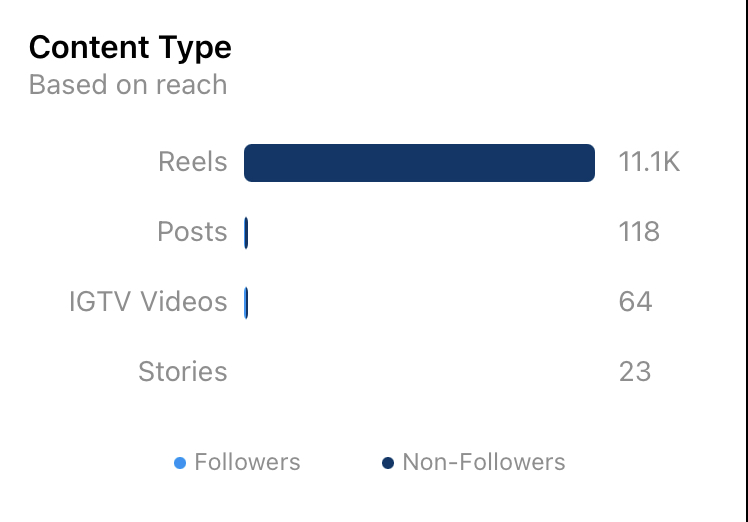
You can see under Content Type that Reels gave us the most reach by a long shot because our follower numbers are currently low. 

If you keep scrolling down, you can see your top Posts, Stories, IGTVs, and Reels based on reach. You will also see your Impressions and Profile Activity. We highly recommend you replicate what works!

I hope this helps clear up some confusion around Instagram Insights. If you are interested in growing your brand online, do not hesitate to contact us.